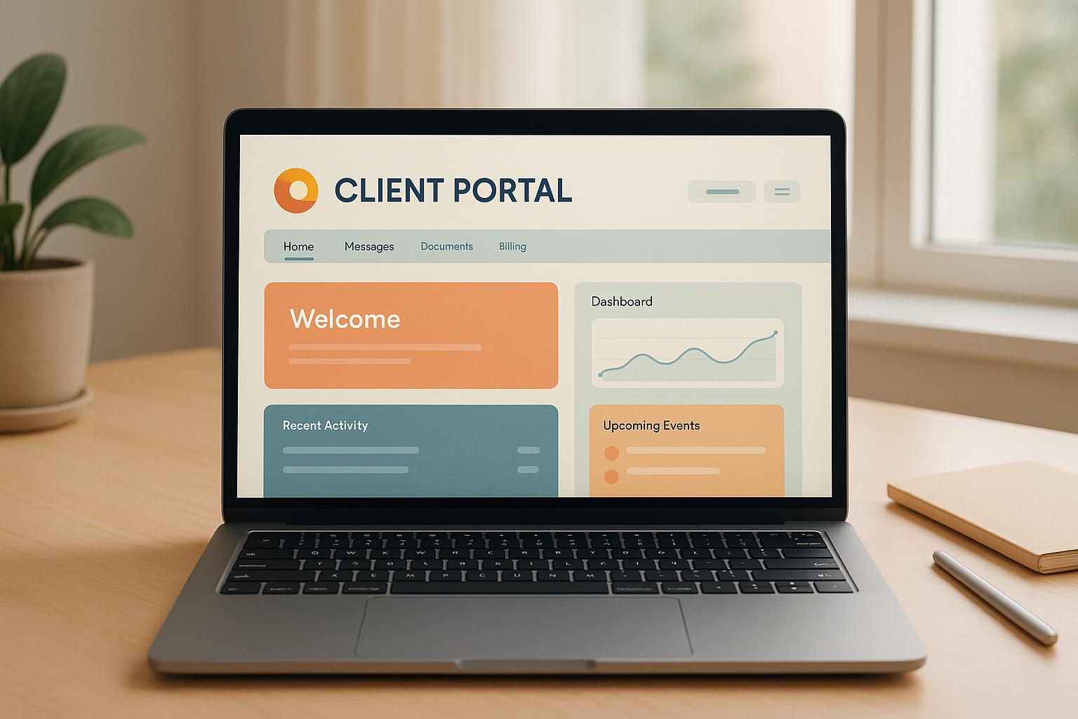
When users visit your client portal, their first impression is formed within 90 seconds - and 90% of that judgment is based on color. Choosing the right colors isn't just about looks; it directly affects how clients perceive your brand. Here's why it matters:
- Color boosts recognition: Consistent use of brand colors increases recognition by up to 80%.
- Colors influence decisions: 85% of consumers say color impacts their purchasing choices.
- Colors evoke emotions: Warm tones like red create energy, while cooler tones like blue build trust.
To create a professional, reliable, and memorable portal:
- Align colors with your brand's identity and values.
- Use consistent colors across all platforms to reinforce recognition.
- Prioritize accessibility with proper contrast and inclusive design.
Your portal’s color scheme is more than decoration - it’s a tool to build trust, enhance usability, and strengthen your brand.
Color Psychology in Branding
Color psychology explores how colors influence thoughts, emotions, and actions. By understanding this connection, businesses can make deliberate color choices that improve digital interactions and create stronger connections with their audience.
Colors aren't just about aesthetics - they evoke specific emotions that can influence customer behavior. For instance, studies show that color affects 85% of purchasing decisions. This highlights how impactful the right color choices can be for your brand and its financial success. With this understanding, you can strategically use colors to shape how clients experience your portal.
How Colors Shape Emotions and Decisions
Colors spark immediate emotional responses, which play a significant role in how clients interact with your brand. Research indicates that 93% of consumers base their purchasing decisions on visual appeal alone.
Different hues evoke different feelings. Warm tones like red, orange, and yellow are associated with energy and excitement, while cooler shades like blue, green, and purple promote calmness and trust. For instance, red often conveys passion and urgency, making it ideal for brands that want to inspire action. On the other hand, blue is linked to stability and reliability, which is why it's a favorite among financial institutions.
"Color impacts how users make decisions online, so understanding color psychology helps you better design sites for conversion."
- Nick Babich
The key is aligning your color choices with the emotions you want to evoke. If your goal is to build trust and convey security, cooler tones like blue and green might be the way to go. If you want to energize clients or encourage quick actions, warmer colors could be more effective. These emotional cues can then translate into stronger brand connections.
Color and Brand Character
Colors also play a significant role in defining your brand's personality. For client portals, using colors that align with your brand’s identity helps create a cohesive and memorable experience. The colors you choose influence how customers perceive and interact with your brand.
Take major brands as examples. McDonald's uses yellow to evoke feelings of happiness, energy, and playfulness, which resonates with families and children. Meanwhile, IBM relies on blue to communicate professionalism, security, and technological expertise.
Consistent color use can also boost brand recognition. Studies show that maintaining a consistent color palette can increase brand recognition by up to 80%. This consistency reinforces your brand’s identity and makes it more memorable to your audience.
Kevin Kaminyar, CEO of Yellow Tree Marketing, shared his experience with choosing brand colors:
"I asked [my clients] what popped into their head when they looked at different colors, and yellow was overwhelmingly positive. They brought up kindness, warmth, empathy - and that aligned with my brand."
- Kevin Kaminyar, CEO, Yellow Tree Marketing
Your client portal is an extension of your brand, so its colors should reflect the qualities you want to emphasize. Whether you want to project professionalism, creativity, reliability, or innovation, the right colors can help communicate those values. Research even suggests that 62–90% of snap judgments about a product are influenced by its color.
The ultimate goal is to create a seamless brand experience. The colors in your portal should complement your other branding elements, working together to deliver a clear and consistent message about who you are and what your business represents.
How Color Schemes Affect Client Portal Experience
The colors you choose for your client portal can directly influence how users interact with it. Research shows that color schemes account for a 6.8% variance in perceived trustworthiness, making them a key element in creating a portal that feels reliable and welcoming.
Colors have the power to evoke emotions that drive user behavior. For example, blue is often associated with trust, which can help clients feel more at ease when sharing sensitive documents. When users feel secure and comfortable with a portal's design, they're more likely to complete tasks, upload documents, and engage positively with your brand.
Building a Unified Brand Experience
Consistency in design across all brand touchpoints reinforces trust and makes interactions feel polished. When your client portal mirrors your website, email templates, and other branded materials, it creates a cohesive experience. This alignment not only strengthens brand recognition but also gives users the impression of professionalism and attention to detail.
Using a consistent color palette ties your portal seamlessly to your overall brand. For instance, if your primary branding revolves around specific colors, applying the same palette to your portal ensures a smooth and unified experience. This approach becomes even more effective when tailored to the unique needs of different industries.
Choosing Colors for Different Industries
The ideal color scheme for a client portal often depends on the industry it serves. For instance, financial services platforms frequently lean on blue to convey trust and dependability. This makes sense when clients are handling sensitive financial data. Similarly, health and wellness apps often incorporate shades of blue and green, which promote a sense of calm and well-being. In contrast, e-commerce platforms tend to use bold colors like orange for "Add to Cart" buttons, as these colors create urgency and encourage action.
Research also highlights blue and green as versatile choices across various industries, as they tend to evoke positive emotions without overwhelming users. Adapting your portal's color scheme to suit your specific audience while maintaining accessibility can significantly enhance the user experience.
Improving Usability with Accessible Colors
Accessible color choices are essential for ensuring that everyone, regardless of visual ability, can navigate and use your portal effectively. Globally, around 1 in 12 men and 1 in 200 women experience color blindness, which makes it critical to consider color vision deficiencies during the design process.
The WCAG 2.0 Level AA guidelines recommend specific contrast ratios (4.5:1 for normal text and 3:1 for large text) to ensure readability. Tools like the WebAIM Contrast Checker can help you confirm that your color combinations meet these standards.
Beyond contrast, it’s important not to rely solely on color to convey information. Pairing colors with icons or text labels ensures that users who struggle to distinguish certain hues can still access all necessary cues. For example, combinations like green and red, blue and purple, or light green and yellow can be challenging for users with color vision deficiencies.
Strong contrast between text and background benefits all users by reducing eye strain and improving readability, especially in different lighting conditions. Thoughtful, accessible color choices not only enhance usability but also show attention to detail, reinforcing trust and satisfaction - key elements in creating an effective client portal.
Best Practices for Portal Color Schemes
Choosing the right color scheme for your portal isn't just about aesthetics - it’s a strategic decision. In fact, studies show that 62–90% of brand assessments are based solely on color.
Matching Colors with Brand Values
The colors you select should reflect your brand’s core identity. Start by considering your mission, vision, and values, then align your color choices with these elements. This creates a seamless connection between your brand and the user experience.
For example, Starbucks uses a "family of greens" to symbolize nature, wealth, and healing. Similarly, Tiffany & Co.’s Robin's egg blue (Pantone 1837), chosen in 1845, has become synonymous with luxury, elegance, and exclusivity. This distinctive hue is now recognized globally as a signature of their brand.
"Color is a power which directly influences the soul." – Wassily Kandinsky
When deciding on colors, think about the emotions and associations you want to evoke. If your brand highlights creativity and innovation, take inspiration from Instagram’s rainbow palette, which represents diversity, fun, and originality. For brands focused on trust and energy, Coca-Cola’s red is a great example - it’s bold, exciting, and encourages impulsive behavior.
Consistency is key to reinforcing these values across all platforms.
Keeping Colors Consistent Across Platforms
Once you’ve chosen your colors, maintain them across every digital touchpoint. This consistency can have a huge impact: a signature color scheme increases brand recognition by 80%, and consistent branding can boost revenue by 23%.
For example, Nickelodeon’s vibrant orange appears on their logo, website, and social media, embodying youthful creativity and adventure. To achieve this level of consistency, create a brand book that outlines your exact color codes (hex, RGB, CMYK) and usage guidelines. This ensures everyone on your team - and any external partners - sticks to the same standards.
Additionally, consider using white-label options to extend your brand’s reach. For instance, hosting your client portal on a subdomain like upload.mydomain.com keeps your branding intact.
Testing and Improving Color Choices
Even the most carefully chosen color schemes need fine-tuning. Testing ensures your colors resonate with users and enhance their experience.
Start with user testing to gather feedback on how your portal’s colors impact trust and usability. A/B testing is another valuable tool - experiment with different text, button, and background colors to see which combinations drive the most engagement.
Accessibility is just as important. With 2.2 billion people worldwide experiencing visual impairments, your color choices should be inclusive. Regularly check for color contrast and readability across devices and screen sizes. Stay up to date with evolving standards like WCAG 3.0’s Advanced Perceptual Contrast Algorithm (APCA), which provides more accurate contrast measurements than earlier methods.
sbb-itb-5a90164
Customization and Branding Features in Collect
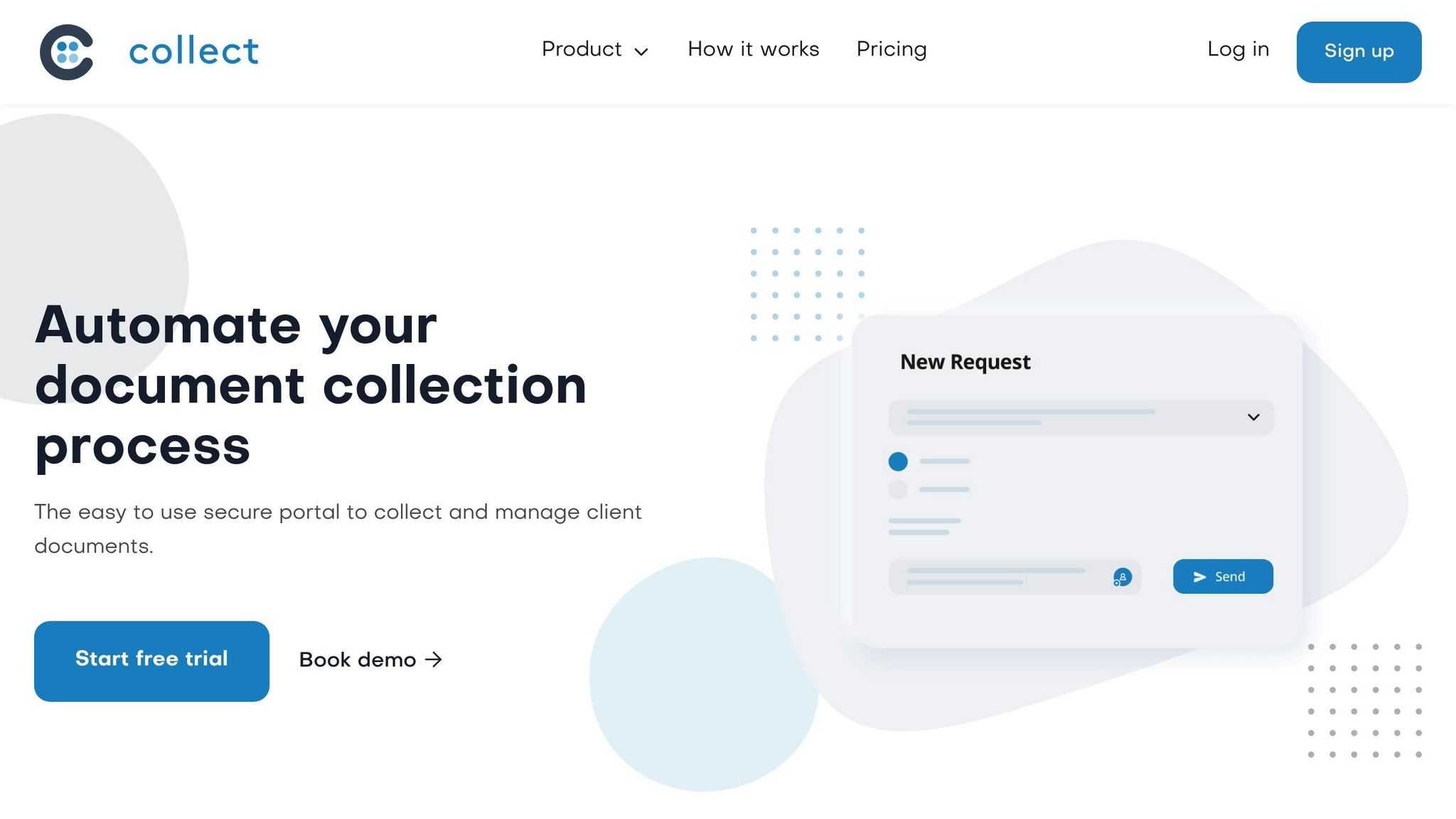
Collect empowers businesses to design client portals that align perfectly with their brand identity. By offering tools for customization and seamless integration, it ensures your portal not only looks professional but also reflects your unique values.
Custom Color Schemes and White-Label Options
With Collect's white-label solutions, you can tailor your portal to match your brand’s voice. Customize colors, logos, and even language to create a cohesive experience. You can also host the portal on a custom domain, reinforcing trust and consistency with your clients. Whether you opt for calming blues or bold, vibrant shades, the strategic use of color can significantly enhance your portal's visual appeal.
This approach ensures your portal feels like an extension of your brand. When clients see your logo, colors, and messaging presented consistently, it strengthens brand recognition and builds trust.
Integrations for Better Workflow
Collect goes beyond aesthetics by offering integrations with popular tools like Zapier, HubSpot, Pipedrive, Docusign, Slack, Box, Dropbox, Google Drive, SharePoint, and OneDrive. These connections make your branded portal part of a larger, more efficient ecosystem.
For instance, Zapier acts as a bridge between different apps, helping you save time on administrative tasks. If a client uploads documents through your portal, Zapier can automatically update your CRM and notify your team, keeping everything streamlined and organized.
Building Brand Identity with Collect
By combining custom branding features with seamless integrations, Collect transforms a simple document collection tool into a full-fledged extension of your brand. The ability to control every aspect of your portal's design enhances professionalism and fosters trust.
When clients interact with your portal, they’re engaging with more than just a service - they’re experiencing your brand’s values through consistent design and functionality. This unified experience helps build stronger emotional connections and supports long-term relationships rooted in trust and recognition.
Conclusion: Why Color Matters in Digital Branding
Choosing the right colors for client portals isn't just about aesthetics - it's a deliberate decision that can directly influence your business's success. Studies reveal that color boosts brand recognition by up to 80% and plays a role in 85% of consumer purchase decisions.
"Colors are more than just visual elements; they evoke emotions, convey messages, and influence decisions." - Crastinum Creative
The financial implications of thoughtful design are just as striking. Companies that prioritize design outperform their competitors on the S&P 500 by as much as 219%. Additionally, maintaining consistent branding through color can lead to a 23% increase in revenue on average. Even small adjustments can yield big results - CXL reported a 21% performance boost simply by switching a call-to-action button from green to red.
Trust is another cornerstone of effective branding. A significant 81% of consumers need to trust a brand before making a purchase, and 71% are more likely to buy from brands they recognize. Consistent use of color not only strengthens this trust but also reinforces your brand identity across every touchpoint.
With Collect’s customizable color schemes and white-label options, you can effortlessly apply these strategies. By leveraging color psychology, ensuring consistency, and prioritizing accessibility, you create a cohesive branding approach that fosters trust and enhances performance.
Think of your portal’s color scheme as your digital handshake - it sets the tone for professionalism and reliability. When executed with care and accessibility in mind, your color strategy becomes a powerful tool, driving engagement and fueling business growth.
FAQs
How do I choose the right colors for my client portal to reflect my brand's identity and values?
To pick the right colors for your client portal, start by reflecting on your brand's personality and core values. Consider the impression you want to leave on your clients - should your business feel professional, welcoming, cutting-edge, or dependable? This is where color psychology comes into play, as different colors can evoke distinct emotions and associations. For instance, blue is often linked to trust and dependability, while green suggests growth and harmony.
With a clear direction in mind, create your color palette by starting with a neutral base and adding primary colors that reflect your brand's identity. Keep the design consistent throughout the portal to maintain a polished and unified appearance that connects with your audience. A thoughtfully chosen color scheme not only reinforces your branding but also builds trust and encourages client engagement.
How can I make my client portal's color scheme accessible for users with color vision deficiencies?
To make sure your client portal works well for everyone, including users with color vision deficiencies, focus on using high contrast ratios - at least 4.5:1 - for text and background elements. Don’t depend solely on color to communicate information. Instead, include labels, icons, or textures to give extra context. Be mindful of tricky color pairings like red and green, which can be hard for many users to tell apart. Lastly, use color blindness simulators to spot and fix any accessibility challenges.
How do the colors in my client portal affect user trust and engagement, and what are the best practices for choosing them?
Colors play a crucial role in shaping how users perceive and interact with your client portal, influencing both emotions and trust. For instance, blue is often associated with trust and security, while green conveys a sense of growth and stability. These choices can help create a polished and welcoming impression.
To get the most out of your color palette, ensure it aligns with your brand identity for a seamless user experience. Use contrasting colors strategically to highlight navigation elements and make key actions stand out. It’s also important to consider how colors are interpreted - for example, in the U.S., red often conveys urgency or passion. Thoughtful color selection can help you create a stronger bond with your users and reinforce confidence in your brand.
Related posts